Platform capabilities
Leverage the power of Apliqo’s advanced capabilities in planning, modeling, reporting, and analytics with IBM Planning Analytics / TM1 - all in one seamless platform.
Platform capabilities
Leverage the power of Apliqo’s advanced capabilities in planning, modeling, reporting, and analytics with IBM Planning Analytics / TM1 - all in one seamless platform.

Transform financial planning and analytics with Apliqo's capabilities
Streamline financial and operational planning with a structured, scalable approach. Apliqo enables real-time forecasting, scenario modeling, and strategic planning to drive business success.

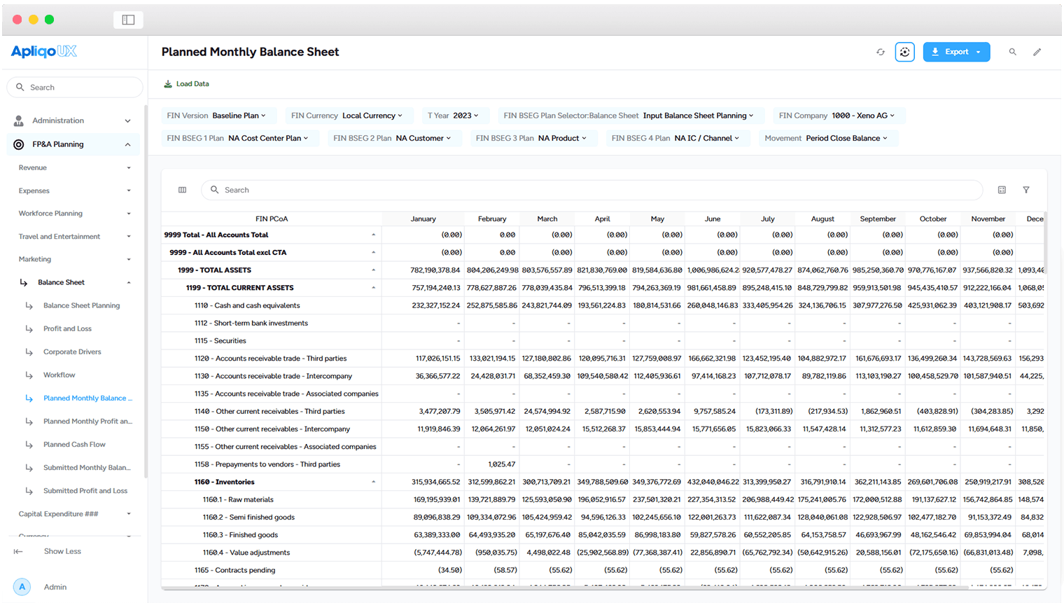
Balance sheet planning
Integrate expense and revenue plans to forecast balance sheet positions, using tailored drivers and sub-models.
Inventories – Days in inventory (entry per year, % of revenue, etc.)
Capital expenditure (CapEx) – Asset investment planning, including depreciation calculations for P&L and balance sheet impact.
Debt and loans – Structured repayment and interest expense forecasting.
Cash flow – Automatically calculated using the indirect cash flow method, ensuring a dynamic, data-driven cash position.
Driver based planning
Focus planning efforts on the factors that truly impact business performance.
Customizable planning drivers – Select and standardize planning drivers for revenue and cost line items.
Dynamic forecasting methods – Assign different forecasting techniques per planning account or business segment.
Top-down & bottom-up alignment – Apply strategic forecasts at the organizational level, while enabling granular, bottom-up adjustments as needed.
Scenario planning
Enhance risk management and opportunity analysisby developing multiple financial scenarios for different business conditions.
Scenario types in Apliqo FPM:
Working budget – Traditional annual budgetcovering a 12-month plan horizon.
Working forecast – Dynamic forecast that includes actuals for past months and estimates for future months.
Rolling forecast– A continuously updated projection over a defined period from a given starting point.
Snapshot versioning – Lock and store any budget or forecast as a frozen reference point for historical comparison.
Transform financial planning and analytics with Apliqo's capabilities
Streamline financial and operational planning with a structured, scalable approach. Apliqo enables real-time forecasting, scenario modeling, and strategic planning to drive business success.
Balance sheet planning
Integrate expense and revenue plans to forecast balance sheet positions, using tailored drivers and sub-models.
Inventories – Days in inventory (entry per year, % of revenue, etc.)
Capital expenditure (CapEx) – Asset investment planning, including depreciation calculations for P&L and balance sheet impact.
Debt and loans – Structured repayment and interest expense forecasting.
Cash flow – Automatically calculated using the indirect cash flow method, ensuring a dynamic, data-driven cash position.
Driver based planning
Focus planning efforts on the factors that truly impact business performance.
Customizable planning drivers – Select and standardize planning drivers for revenue and cost line items.
Dynamic forecasting methods – Assign different forecasting techniques per planning account or business segment.
Top-down & bottom-up alignment – Apply strategic forecasts at the organizational level, while enabling granular, bottom-up adjustments as needed.
Scenario planning
Enhance risk management and opportunity analysisby developing multiple financial scenarios for different business conditions.
Scenario types in Apliqo FPM:
Working budget – Traditional annual budgetcovering a 12-month plan horizon.
Working forecast – Dynamic forecast that includes actuals for past months and estimates for future months.
Rolling forecast– A continuously updated projection over a defined period from a given starting point.
Snapshot versioning – Lock and store any budget or forecast as a frozen reference point for historical comparison.
Business modeling
Build dynamic financial models tailored to your business needs. Apliqo’s flexible modeling capabilities allow for scenario testing, strategic decision-making, and agile business planning.
Integrated 3-way financial model
Apliqo’s Unified Performance Management (UPM)framework consolidates financial and operational planning into a single, structured system. This integrated approach ensures best-practice financial management across the organization.
Comprehensive financial integration:
Profit and loss, balance sheet, and cash flow– Seamlessly connect all financial statements for a complete financial view.
Direct and indirect cash flow methods – Adapt to different financial planning approaches with built-in cash flow methodologies.
Customizable chart of accounts – The model aligns with your specific accounting standards (IFRS, GAAP, local regulations), ensuring full compliance.
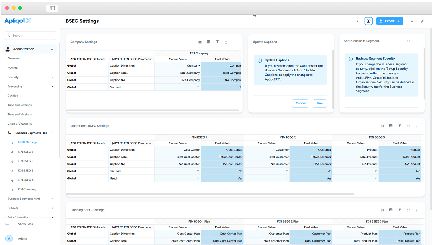
Business Segmentation
Gain a structured and detailed understanding of business performance by analyzing key operational dimensions like:
Geographies – Compare financial results across regions.
Products and services – Evaluate profitability at the product level.
Sales channels– Assess performance across B2B, B2C, and e-commerce.
Cost Centers and divisions – Track expenses and budget variances in real time.
Workforce Attrition Model
Apliqo's Workforce Attrition Model is designed to help organizations predict and manage employee turnover.
By analyzing factors such as employee demographics, job satisfaction, and performance metrics, the model provides insights into attrition patterns.
This enables companies to proactively address retention challenges and make informed decisions regarding resource allocation and strategic planning.
The model's use of machine learning algorithms ensures continuous improvement by learning from new data over time
Business modeling
Build dynamic financial models tailored to your business needs. Apliqo’s flexible modeling capabilities allow for scenario testing, strategic decision-making, and agile business planning.
Integrated 3-way financial model
Apliqo’s Unified Performance Management (UPM)framework consolidates financial and operational planning into a single, structured system. This integrated approach ensures best-practice financial management across the organization.
Comprehensive financial integration:
Profit and loss, balance sheet, and cash flow– Seamlessly connect all financial statements for a complete financial view.
Direct and indirect cash flow methods – Adapt to different financial planning approaches with built-in cash flow methodologies.
Customizable chart of accounts – The model aligns with your specific accounting standards (IFRS, GAAP, local regulations), ensuring full compliance.
Business Segmentation
Gain a structured and detailed understanding of business performance by analyzing key operational dimensions like:
Geographies – Compare financial results across regions.
Products and services – Evaluate profitability at the product level.
Sales channels– Assess performance across B2B, B2C, and e-commerce.
Cost Centers and divisions – Track expenses and budget variances in real time.
Workforce Attrition Model
Apliqo's Workforce Attrition Model is designed to help organizations predict and manage employee turnover.
By analyzing factors such as employee demographics, job satisfaction, and performance metrics, the model provides insights into attrition patterns.
This enables companies to proactively address retention challenges and make informed decisions regarding resource allocation and strategic planning.
The model's use of machine learning algorithms ensures continuous improvement by learning from new data over time
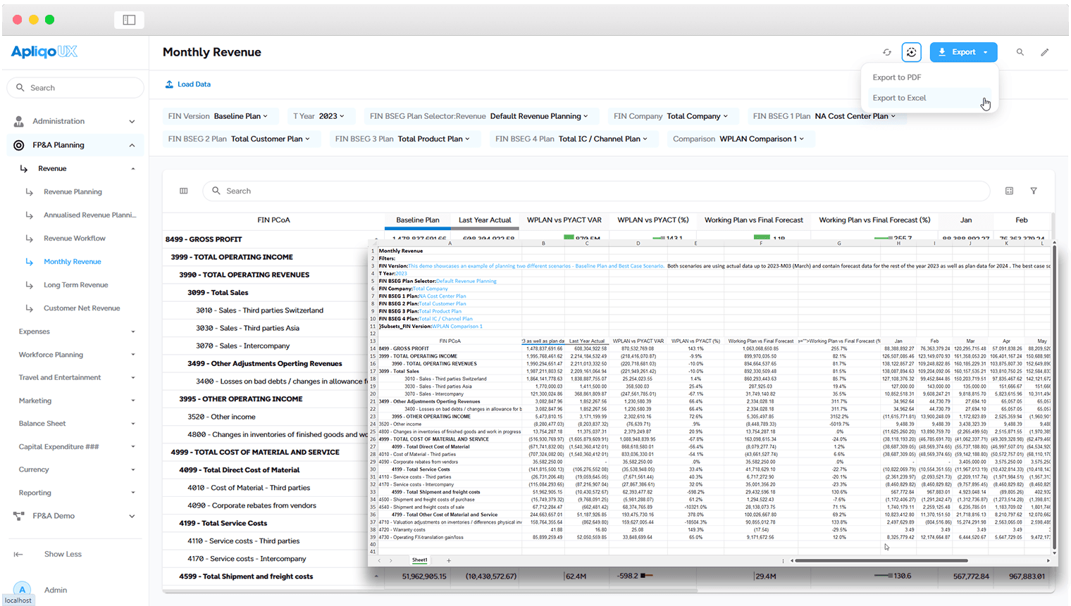
Ready-to-use reporting
Deliver accurate, real-time financial reports with ease. Apliqo provides automated, formatted reporting that ensures compliance, transparency, and insightful decision-making.

No-code report creation
Enhance forecasting accuracy and reduce planning efforts with a best-practice reporting model designed for financial transparency and strategic decision-making.
Comprehensive KPI library – Access 100+ pre-defined financial KPIs or define your own for standardized performance tracking.
Version comparisons and variance analysis – Quickly analyze actuals vs. budget and other critical financial benchmarks.
Rolling time analysis – Leverage built-in time intelligence for quarterly, half-year, annual, YTD, and YTG reporting.
Unlimited business segmentation – Customize reports by cost centers, profit centers, regions, divisions, and more.
Prebuilt reporting model
Empower finance teams with ad-hoc, interactive analytics to uncover key business drivers.
Explore the story behind the numbers – Drill into dimensions to identify performance drivers and pinpoint root causes.
Advanced drill-down capabilities – Interact with multidimensional data dynamically.
Consistent data visualization – Ensure a structured, reliable reporting experienceacross all financial analyses.
Self service with enhanced visualization
Enable finance teams to adapt and tailor reports without IT dependency.
Dynamic parameter adjustments– Users can modify reporting rules for greater self-service capabilities.
Empower power users– Create, customize, and publish reports and workflows for enterprise-wide access.
Seamless workflow integration– Automate reporting processes and distribute insights effortlessly.
Ready-to-use reporting
Deliver accurate, real-time financial reports with ease. Apliqo provides automated, formatted reporting that ensures compliance, transparency, and insightful decision-making.
No-code report creation
Enhance forecasting accuracy and reduce planning efforts with a best-practice reporting model designed for financial transparency and strategic decision-making.
Comprehensive KPI library – Access 100+ pre-defined financial KPIs or define your own for standardized performance tracking.
Version comparisons and variance analysis – Quickly analyze actuals vs. budget and other critical financial benchmarks.
Rolling time analysis – Leverage built-in time intelligence for quarterly, half-year, annual, YTD, and YTG reporting.
Unlimited business segmentation – Customize reports by cost centers, profit centers, regions, divisions, and more.
Prebuilt reporting model
Empower finance teams with ad-hoc, interactive analytics to uncover key business drivers.
Explore the story behind the numbers – Drill into dimensions to identify performance drivers and pinpoint root causes.
Advanced drill-down capabilities – Interact with multidimensional data dynamically.
Consistent data visualization – Ensure a structured, reliable reporting experienceacross all financial analyses.
Self service with enhanced visualization
Enable finance teams to adapt and tailor reports without IT dependency.
Dynamic parameter adjustments– Users can modify reporting rules for greater self-service capabilities.
Empower power users– Create, customize, and publish reports and workflows for enterprise-wide access.
Seamless workflow integration– Automate reporting processes and distribute insights effortlessly.
AI predictive analytics
Leverage AI and advanced analytics to anticipate future trends and optimize financial strategies. Apliqo enhances decision-making with machine learning, predictive modeling, and real-time insights.
Predictive machine learning
Apliqo FPM enhances forecasting and scenario planning by:
Automated trend analysis– Identify patterns and predict future performance.
Scenario-based simulations – Test financial strategies before implementation.
Continuous model learning– Improve forecast accuracy with historical data insights.
LLM integration
Various LLMs can be integrated with Apliqo to automate narrative report generation, providing insightful commentary on financial results and key performance indicators (KPIs).
Python integration
Python’s greatest advantage is its expansive and continuously evolving ecosystem. Just as TM1py simplifies Python development for TM1, various packages enable seamless integration with Salesforce, NetSuite, Google Sheets, SAP, and more. Acting as a Swiss Army knife for data integration, TM1py empowers TM1 developers—especially when dealing with cloud-based data sources that are otherwise difficult to access using standard TM1 functionality.
MS Office Integration
Integration with Excel
Augmenting Microsoft Excel with real-time access. Seamlessly integrate Apliqo FPM with Microsoft Excel, combining Excel’s flexibility with enterprise-grade real-time financial reporting.
Leverage structured financial models while maintaining Excel’s familiar user experience.
Workflow management
Ensure efficiency and compliance with structured workflows for approvals, budgeting, and reporting. Apliqo streamlines financial processes, reducing manual effort and improving collaboration.

Adaptive workflow processes – governance and control
Enhance collaboration and efficiency with structured workflow automation.
Guided user workflows – Reduce training efforts and input errors.
Status tracking by business segments – Monitor plan progress in real time with user-based tracking.
Audit-ready change logs – Every update includes timestamps, user identification, and comments, ensuring full transparency.
Planning and reporting workflows
Enable timely execution of planning and reporting processes, such as budgeting and forecasting, with flexible workflows configured by power users.
Monitor the progress of each plan type across business segments, with status updates tracked by user, timestamp, and optional comments, ensuring transparency and accountability.
Collaboration
Enhance organization-wide collaboration with real-time notifications and comments in Apliqo, ensuring seamless communication and alignment.
Workflow management
Ensure efficiency and compliance with structured workflows for approvals, budgeting, and reporting. Apliqo streamlines financial processes, reducing manual effort and improving collaboration.
Adaptive workflow processes – governance and control
Enhance collaboration and efficiency with structured workflow automation.
Guided user workflows – Reduce training efforts and input errors.
Status tracking by business segments – Monitor plan progress in real time with user-based tracking.
Audit-ready change logs – Every update includes timestamps, user identification, and comments, ensuring full transparency.
Planning and reporting workflows
Enable timely execution of planning and reporting processes, such as budgeting and forecasting, with flexible workflows configured by power users.
Monitor the progress of each plan type across business segments, with status updates tracked by user, timestamp, and optional comments, ensuring transparency and accountability.
Collaboration
Enhance organization-wide collaboration with real-time notifications and comments in Apliqo, ensuring seamless communication and alignment.
Secure and scalable technology
Maintain data integrity with centralized, secure data management. Apliqo integrates multiple sources into a unified platform, ensuring accuracy, consistency, and governance across your organization.

External connectors for fast implementation
Easily integrate Apliqo FPM with external systems to expand your operational and analytical capabilities. A growing number of out-of-the-box connectors are available, including:
SAP
Xero
DATEV
FinancialForce (Salesforce)
Custom integrations
For non-standard data sources or custom requirements, leverage built-in ETL (Extract, Transform, Load) capabilities. Easily map new GL accounts, business segments, and reporting structures while maintaining full flexibility in your data integration process.
Advanced permission and access management
Ensure secure and controlled access with a granular permission system tailored to different user roles. The Apliqo FPM security model is based on users and groups, with predefined roles. Any user profile can be customized for more detailed read/write accesscontrol. Element-level securityensures restricted access to specific versions.
Secure and scalable technology
Maintain data integrity with centralized, secure data management. Apliqo integrates multiple sources into a unified platform, ensuring accuracy, consistency, and governance across your organization.
External connectors for fast implementation
Easily integrate Apliqo FPM with external systems to expand your operational and analytical capabilities. A growing number of out-of-the-box connectors are available, including:
SAP
Xero
DATEV
FinancialForce (Salesforce)
Custom integrations
For non-standard data sources or custom requirements, leverage built-in ETL (Extract, Transform, Load) capabilities. Easily map new GL accounts, business segments, and reporting structures while maintaining full flexibility in your data integration process.
Advanced permission and access management
Ensure secure and controlled access with a granular permission system tailored to different user roles. The Apliqo FPM security model is based on users and groups, with predefined roles. Any user profile can be customized for more detailed read/write accesscontrol. Element-level securityensures restricted access to specific versions.
